HOW TO: PACK UP A HOUSE
There is a rich history of instruction books from at least the 1870’s onwards, including self-defence for women and early road maps using photographs and written instructions on how to get from A to B.
More recent ‘How To’ instructional books vary from the serious (Haynes Manuals, Dorling Kindersley) to the irreverent pastiche (Ladybird ‘How It Works’ and ‘How to Build a Fire and other Things Your Grandfather Knew by Erin Bried). Arguably less popular than they were due to the explosion in online videos, the serious instruction books have provided a rich seam of ironic inspiration for the humourous versions.
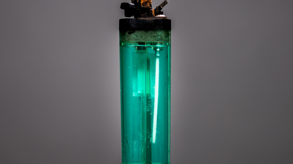
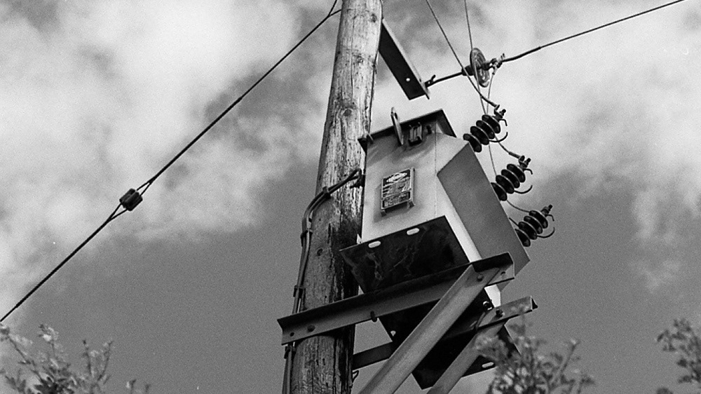
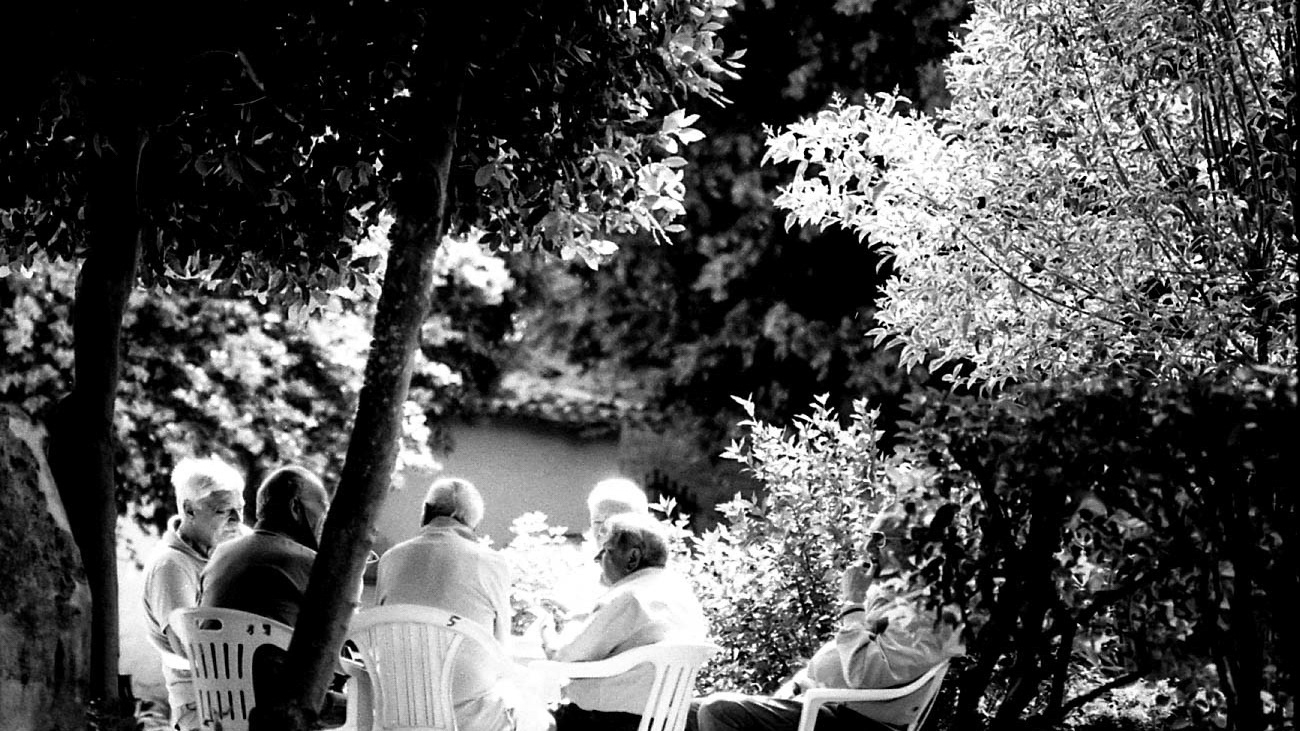
How To – Pack up a House uses postmodernism to combine different media techniques and present a concept that will be readily understood but created using a different technology to that which might be expected. Antiquated cyanotype is co-opted to instruct a process that would historically use photographs, partly to provide an aesthetic documentary but also to provide ironic structure, one simple process mirroring another (the act of assembling a box). Susan Derges is one artist who used to make photograms and stopped when the Cibachrome film she used, ceased to be available in 2009. As Derges notes (2017): “The disappointment of the digital is the blandness or perfection of the print after working with all these cameraless techniques”. It is this ‘imperfection’ and uncertainty that How To: Pack up a House aims to recreate – a process that arguably also mirrors that of moving house itself; apparently the most stressful thing we do – ahead of childbirth, starting a new job and divorce! This unorthodox approach to presenting a ‘straight’ photograph can also be evidenced in the work of Richard Mosse. Using an obsolete infrared film to capture Congolese soldiers in hues of pink and purple to propose a dichotomy between what we expect and what we see. Mosse notes that shocking pink is no different to black and white – we don’t see in either colour and regardless of subject something beautiful “will make people sit up” (Mosse 2013: 5’40”). This is the intention with cyanotype, to disorientate the viewer to consider all processes: practical, technical and artistic.
